New Onboarding Flow
Drives Signups to Subscribers

Timeline

Q4 2023 - Q4 2024

My Role

Lead Product Designer

Scope

Monetization strategy, onboarding UX/UI, rapid prototyping, A/B testing

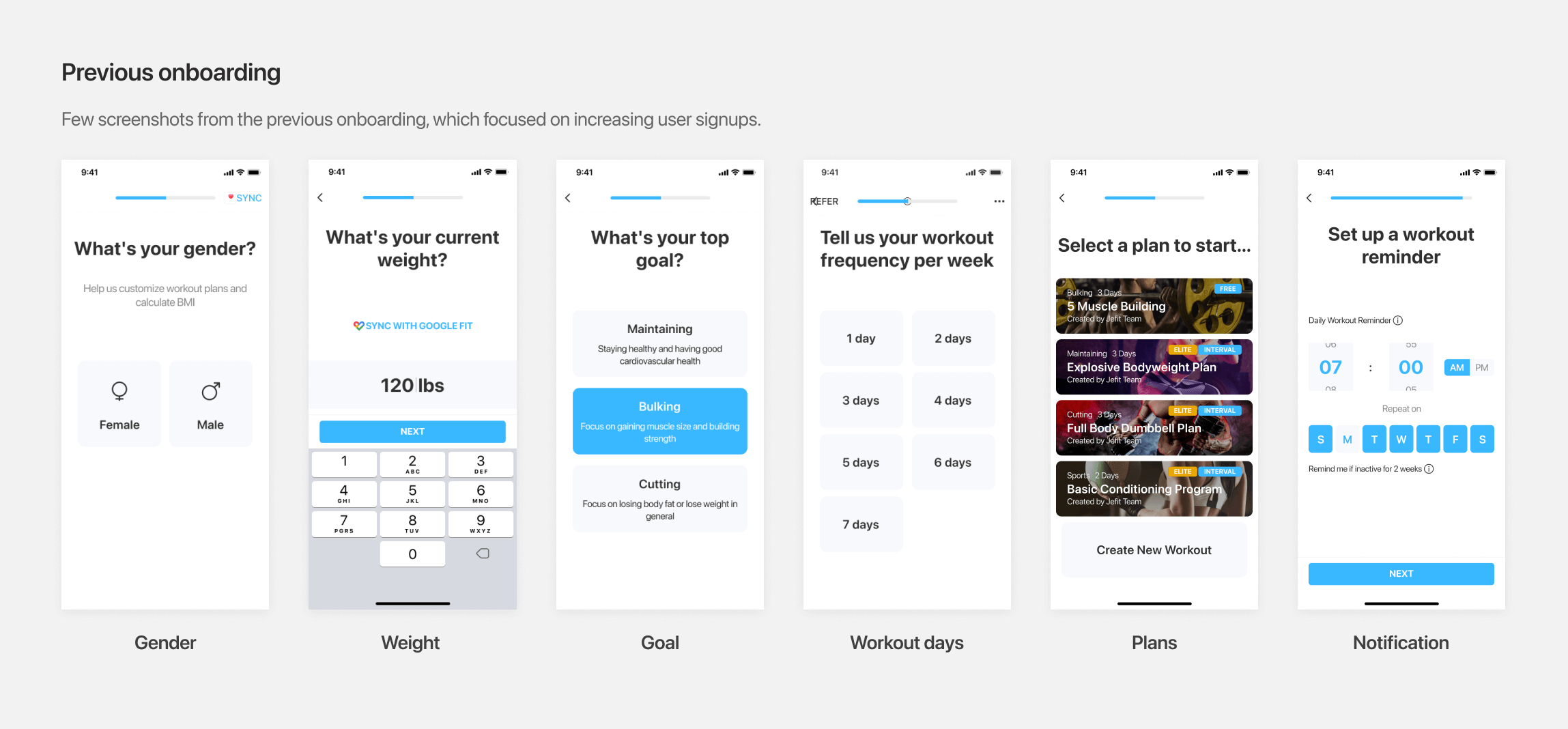
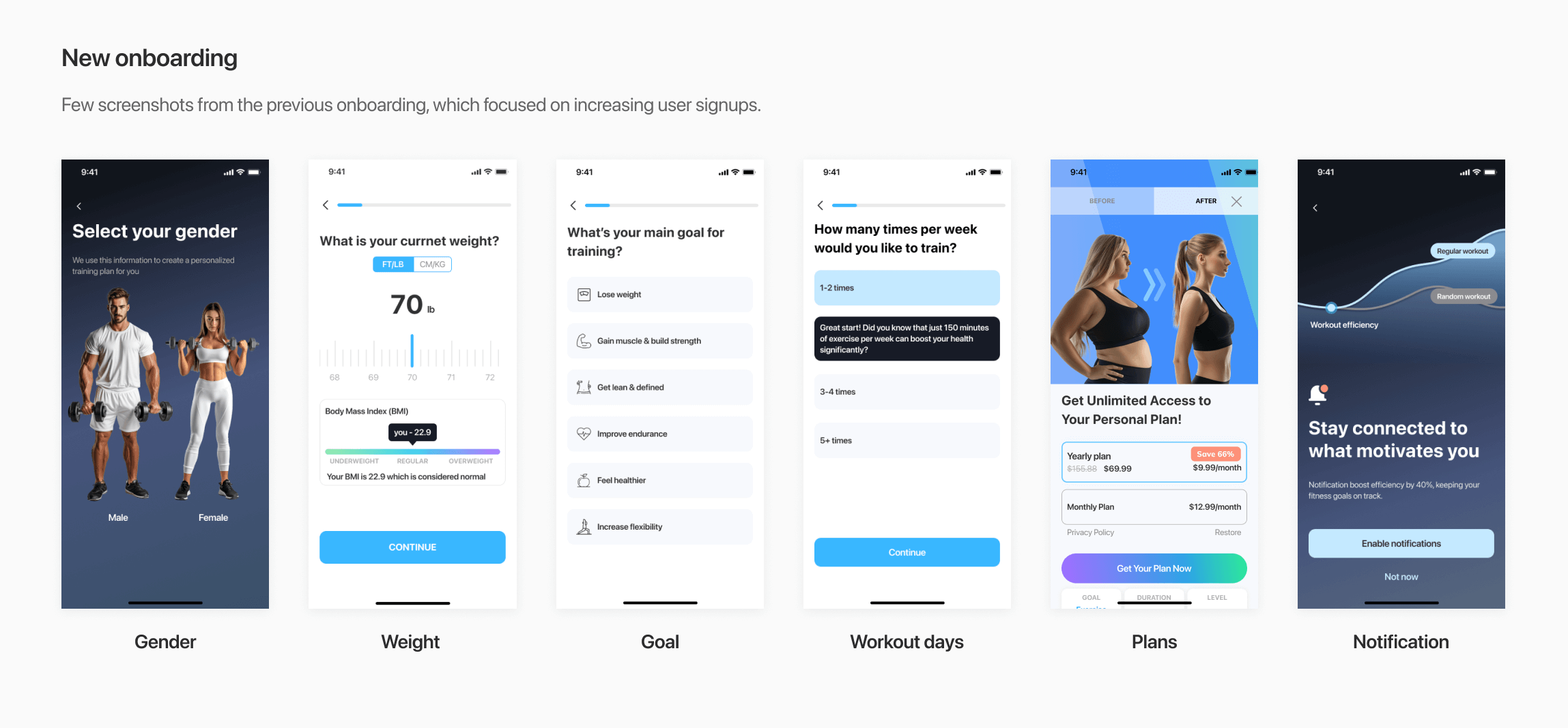
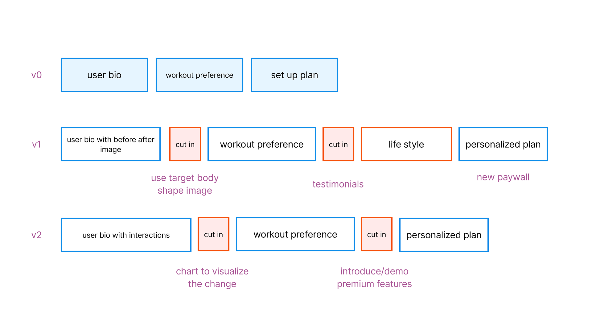
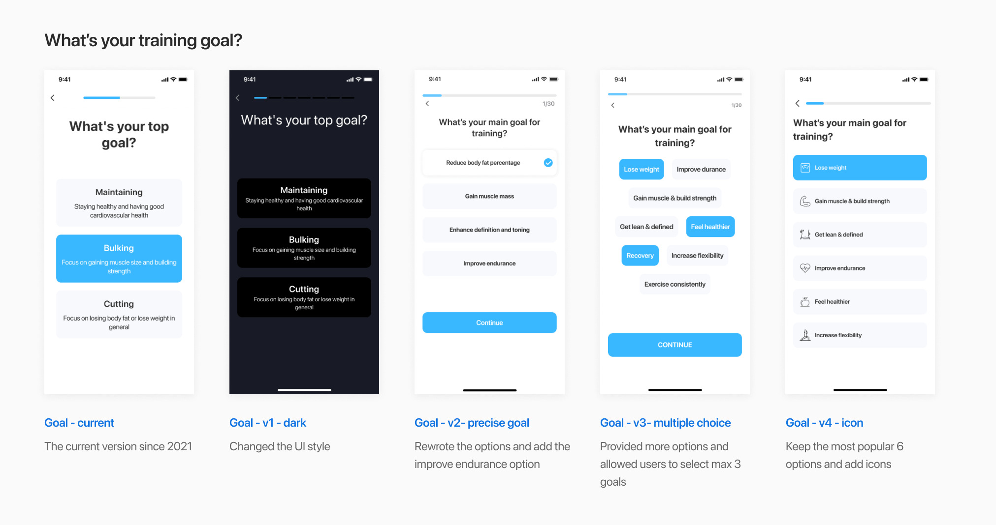
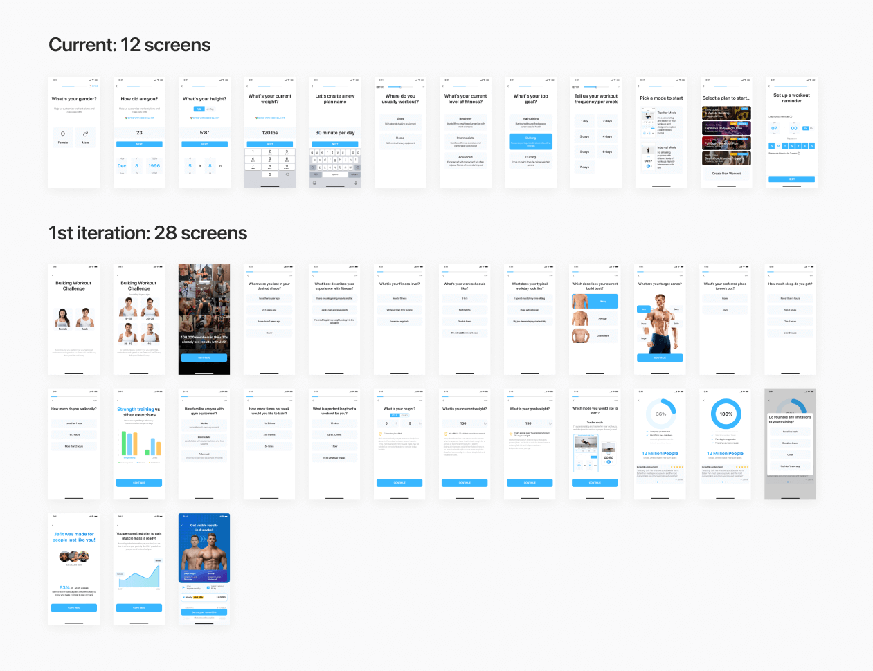
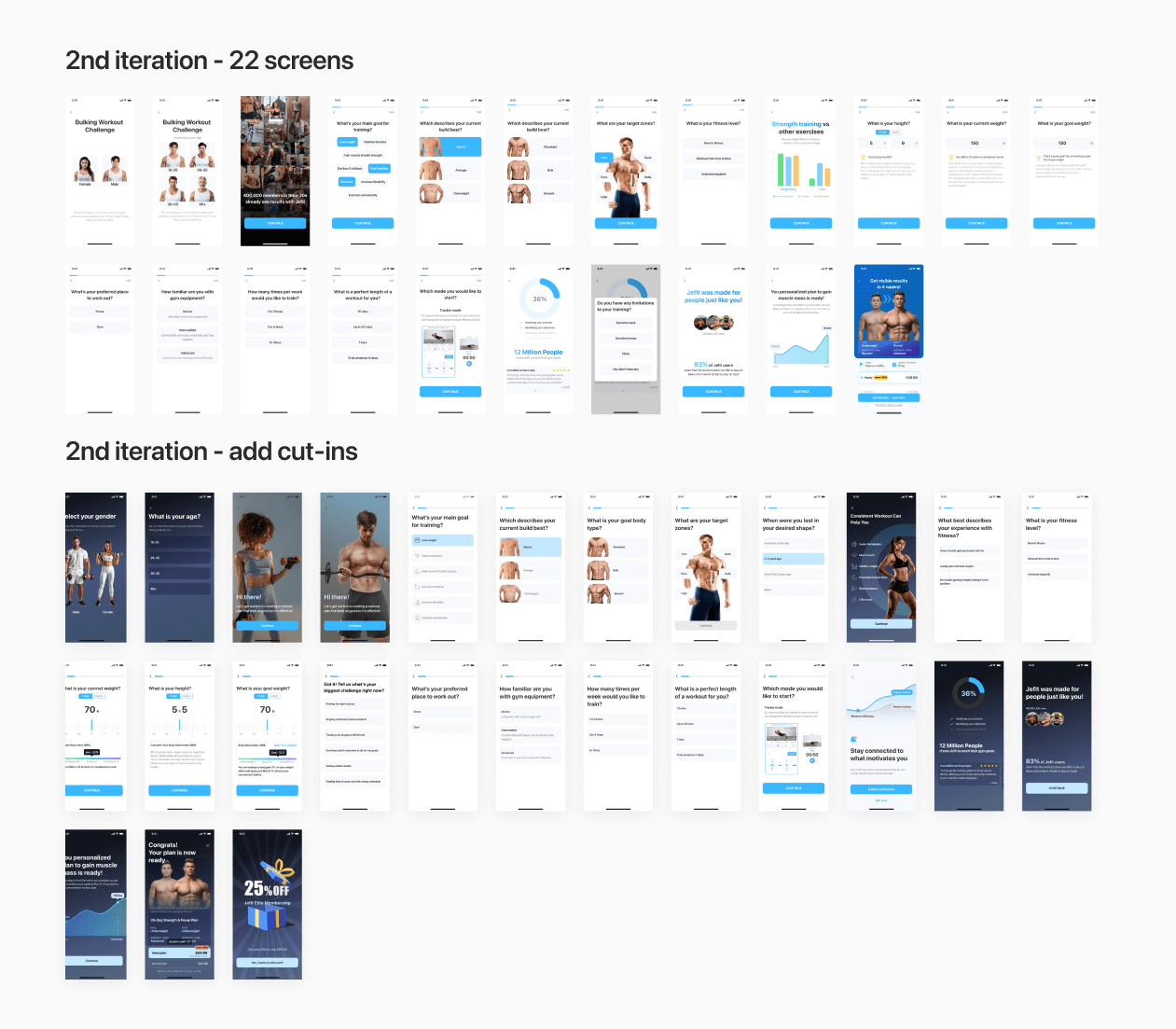
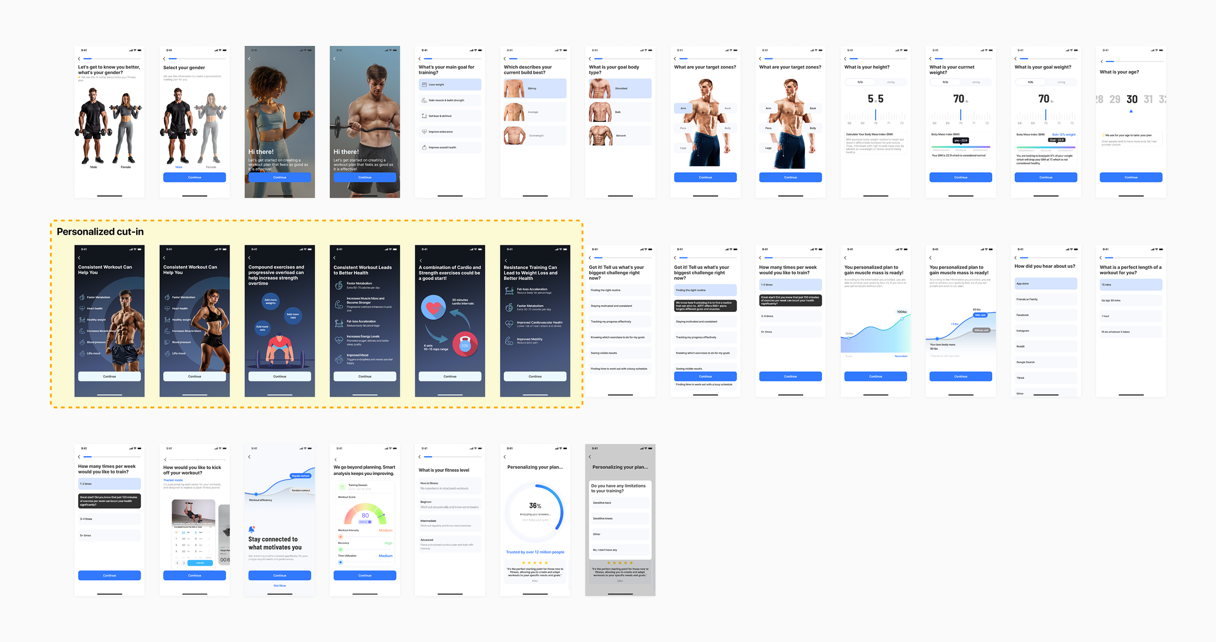
I led the redesign of JEFIT's onboarding from the ground up, reframing it from a fast sign-up flow into a goal-based, conversion-focused experience. Working closely with PM, I ran multiple rounds of A/B testing across flow structure, paywall design, and platform-specific variations.

The new flow outperformed every previous benchmark, driving a ~150%* increase in monthly revenue compared to the same period the prior year.

*Due to NDA, the data are approximate.
Before & After
A before after image of mobile interfacesA before after image of mobile interfaces
Impact
Outperforming Past Revenue Benchmarks
After launching the new onboarding flow, we saw a major shift in when users chose to pay. As shown in the chart, revenue generated during onboarding increased significantly—surpassing both post-onboarding revenue and the platform’s previous overall benchmarks.

PAID CONVERSIONS

Onboarding vs Non-Onboarding

Last 12 months
Onboarding users Non-onboarding users
Onboarding conversions rose significantly after new flow launched in Oct 2024.

After the new onboarding flow launched, paid conversions during onboarding surpassed non-onboarding revenue for the first time.

This is an ongoing project where we continuously test ideas and refine every step of the onboarding process.

Here’s a closer look at my contributions in making it happen.
context
Reframing Onboarding as a Revenue Lever
In early 2024, JEFIT’s revenue began to decline despite stable traffic and no major product regressions. Funnel analysis showed that a large portion of revenue potential lived in onboarding, yet paid conversion during onboarding remained around 15%.

Historically, onboarding had been optimized for fast sign-ups rather than for helping users understand the value of upgrading. I was brought in to rethink onboarding as a conversion-focused experience, without breaking trust or overwhelming new users.
Problems
Where the Onboarding Fell Short
The existing onboarding experience was intentionally lightweight.

Users created an account in just a few steps and were then dropped into the app with minimal guidance. This led to these issues:
A before after image of mobile interfaces
Onboarding moved users to the paywall without helping them invest time, effort, or personal input, resulting in weak emotional commitment to continue.
Key paid features were not surfaced or explained during onboarding, making the upgrade feel abstract
Onboarding asked broad, non-specific questions that failed to reflect users’ individual goals. are not personalized for users' needs
Strategy
Build Trust and Relevance Early
Rather than simply redesigning the paywall, I focused on the steps leading up to it. The core strategy was to build trust and relevance before asking users to pay.

Competitor research showed that high-performing fitness apps often help users imagine outcomes early, making the value proposition feel tangible. However, instead of copying generic before-and-after visuals, I aligned the approach with JEFIT’s strengths: personalized plans, structured training, and progress tracking.

The goal was to help users feel that the product was built for them before presenting a subscription offer.
A before after image of mobile interfaces
SOlution
Clear Goals,
Better Results
During my early exploration of the onboarding experience, I realized we had overlooked a critical step: understanding users' training goals. This gap became clear as I studied competitors who leveraged goal-setting to personalize workout plans. Beyond just customization, it made users feel seen and supported—something our flow was missing.
With this understanding, I revamped our approach by replacing generic options like "Maintain," "Bulk," and "Cut" with user-friendly terms such as "Lose Weight," "Gain Muscle," and others that resonate better with all fitness levels.
A before after image of mobile interfaces
Bonus takeaway
In the testing results, another finding is that the majority of users pick "Gain muscle" and "Loss weight" as their primary goal, which leads to a specific paywall targeting these groups in the paywall screen iterations.
Solution
Tailoring Paywalls by Platforms
Through a series of A/B tests, we discovered that the most effective paywall varies between iOS and Android users.
By iterating on layout, visuals, and messaging, we identified high-performing versions tailored to each platform. These tests led to a measurable increase in conversion rates and highlighted the importance of designing with platform-specific user behavior in mind—even for the same core flow.
iOS version
Android version
solution
Pacing Onboarding to Build User Commitment
A common assumption was that a shorter onboarding flow would reduce drop-off. However, through user research and testing, I discovered that a slightly longer onboarding—when designed thoughtfully—could actually improve engagement and conversion.
By breaking the flow into focused, visually engaging steps and adding brief cut-off screens to pace the experience, users felt more guided rather than overwhelmed. This structure gave them time to reflect on their goals, feel invested in the process, and build commitment early on.
Instead of rushing users through, we gave them space to connect with the product, leading to a measurable increase in paid conversions.
Iterations
A before after image of mobile interfacesA before after image of mobile interfaces
Final version
A before after image of mobile interfaces
Takeaways
1. Data-Driven Rapid Iteration
This project strengthened my ability to navigate ambiguity and move quickly by collaborating with PMs to run A/B tests. Turning data insights into actionable design changes allowed me to continuously iterate, boosting conversion and sharpening my sense of what works in product design.
2. Designing Beyond One-Size-Fits-All
We discovered significant differences in preferences between iOS and Android users. By customizing themes and interactions for each platform, we increased user trust and conversion rates. This taught me the importance of deeply understanding user context to deliver truly effective design solutions.