Redesign Workout Planning Screen
to Boost Activation

Timeline

Q2 2023 - Q4 2024

My Role

Lead Product Designer

Scope

Product strategy, UX & UI design, prototyping, A/B testing

Team

Product Manager, Engineers

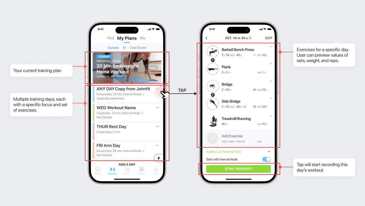
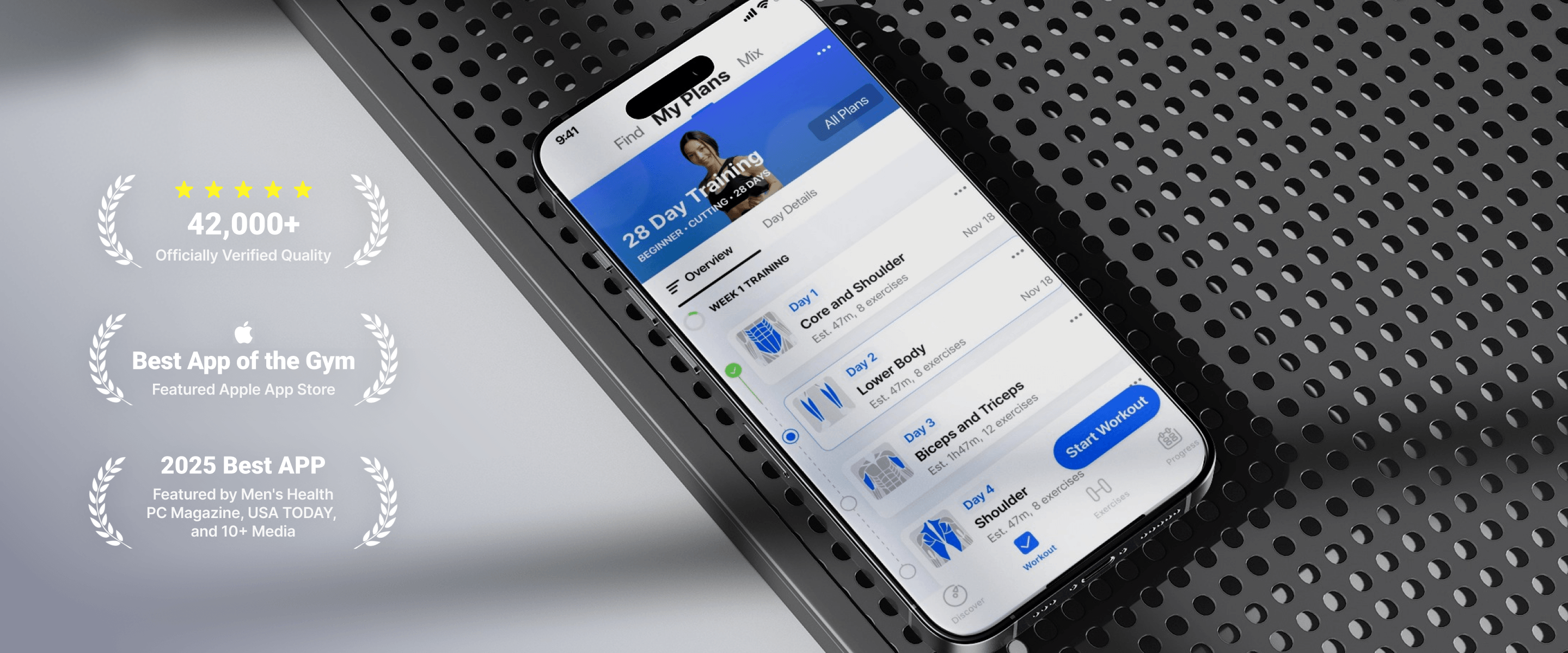
JEFIT is a mature B2C fitness app with over 20M users worldwide, helping people plan workouts, track training, and build long-term fitness habits.

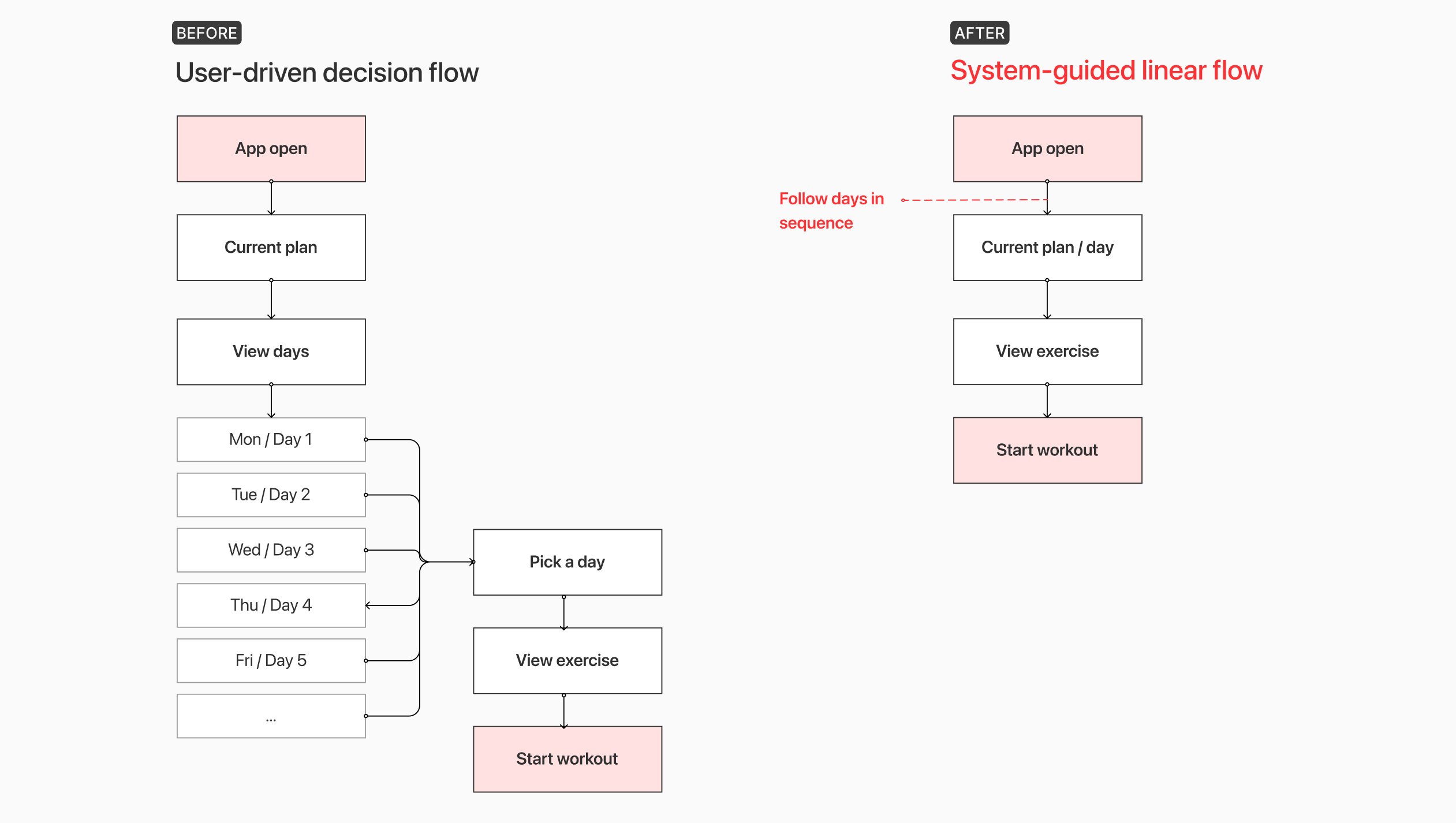
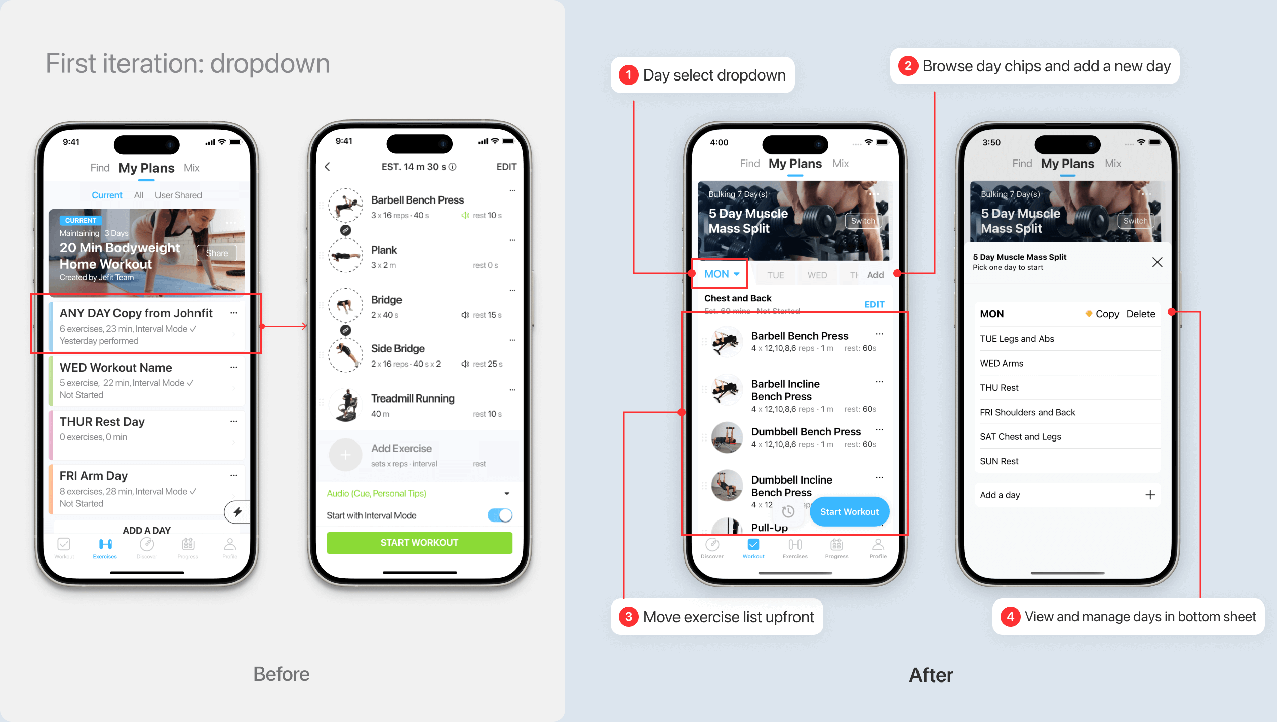
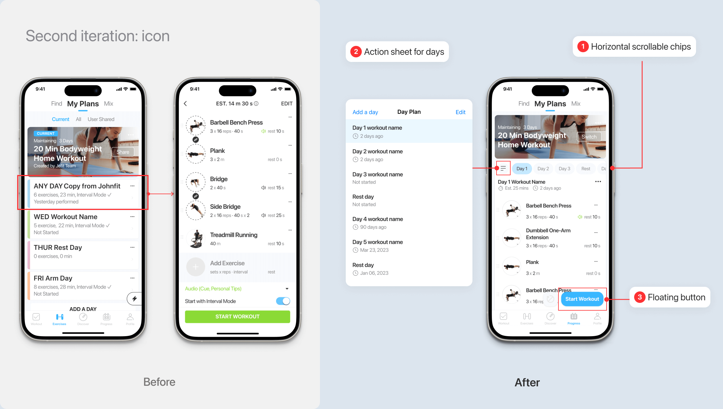
As the lead designer on this project, I reworked JEFIT’s planning and workout tracking flow to reduce early drop-off and help more users complete their first workouts.

Impact & Structural Signal
Jump to Final Design ↓
The redesign drove measurable early-stage gains:
+36%
New user activation rate
1m40s
faster in user activation time
Data are compared to the same period in previous years. Due to the NDA, the data are approximate. Do not share.

" Great new exercise UI. The old UI had lots of issues so I appreciate the attention to the user experience and making the app better. I really like using it to log my workouts!

Josh Buchsbaum

Google play store
19 people found this review helpful

" The changes done to the workout section is phenomenal! I love how the days are now on the horizontal bar and how easily I can switch between my morning stretching routine and then back to my workout routine and it remembered what day I was last on. Great work Jefit Team!

User: xErebus

Jefit community post
But beyond metrics and reviews, it revealed something more important.
A 15-year product had trained users to treat plans as flexible collections. By surfacing a recommended workout, we weren’t just simplifying the UI —

we were redefining how the system should behave.

The tension between freedom and guidance became the real design problem.
A Product With Users, But No Momentum
JEFIT is a workout tracking app designed for people who want to build strength and train consistently over time.
Three dot matrix charts showing user progression: 100% sign up, 23% start workout, and 9% 3 day retention highlighted in blue.
While acquisition remained stable, a critical issue persisted: fewer than one-third of new users ever completed their first workout.
The old entry flow looked like this:
Open app → Browse plan → Pick day → Start workout
A before after image of mobile interfaces
At the exact moment when motivation was highest, the system introduced the most friction. The issue wasn’t missing features. It was decision overload
The core business goal of this project was to improve activation rate, while the design goal was to simplify the decision-making process without breaking existing user habits.
Early Structural Assumption
This change reduced visual complexity while preserving user autonomy — an intentional compromise to avoid alienating existing users.
At this stage, the structure was still flexible: users could either follow the suggested path or self-navigate freely.
A before after image of mobile interfaces
Early Iterations & What Failed
1. Hiding the Day List
In an early iteration, I moved the full day list into a dropdown to reduce visual noise and keep the primary screen focused on exercises. The intention was to simplify the interface without removing user choice.
A before after image of mobile interfaces
However, usability testing revealed an unintended consequence. While the screen appeared cleaner, users struggled to understand how the plan was structured. They hesitated when trying to switch days and often reopened the dropdown repeatedly to reorient themselves.
The issue wasn’t that the structure disappeared — it became invisible.

By hiding the day list, I had reduced surface complexity but weakened structural clarity. What felt like simplification was, in reality, concealment.
2. Speed Without Context
In the next iteration, I replaced the vertical day list with compact horizontal chips to make navigation feel faster and lighter.

The hypothesis was straightforward: if users could switch days more quickly, they would start workouts sooner.
A before after image of mobile interfaces
Across these explorations, one pattern became clear:
Any solution that required page transitions or forced users to choose one model over the other introduced friction. Switching between “exercise-first” and “day-based” views consistently created context loss, especially when plans exceeded one screen in length.
A before after image of mobile interfaces
What These Iterations Revealed
Both iterations attempted to reduce friction by minimizing visible complexity — first by hiding the day list, then by compressing it.

In both cases, the interface became visually lighter, but structurally weaker. The first iteration concealed hierarchy. The second removed decision context.
A before after image of mobile interfaces
These experiments made one thing clear: the problem was not the number of options. It was how progression and choice were expressed.

Users needed clarity about how days related to each other before they could confidently start.
Breakthrough: Two Perspectives, One Structure
The breakthrough came when I stopped treating Day and Exercise as hierarchical levels, and instead reframed them as two perspectives of the same plan.
Instead of navigating deeper into structure, users could switch lenses within the same context. I introduced a hybrid tab model:
Overview: surfaces the recommended workout and emphasizes immediate action.
Day Details: exposes the full plan structure with contextual metadata such as muscle focus and equipment.
A before after image of mobile interfaces
Crucially, switching tabs does not trigger a page transition. The selected day remains synchronized across both views, and a single, consistent “Start Workout” CTA anchors activation. Users do not leave the home context. They simply change perspective.
This eliminated spatial disorientation while preserving structural transparency:
New users receive guidance by default.
Experienced users retain the ability to evaluate and choose.

Rather than choosing between automation and autonomy, the final structure allowed both to coexist within a unified system.
Introduce the new activation flow:
One tap to start workout
Feature
A Stable, Dual-Perspective Structure
The final design reframes the plan experience into two synchronized perspectives: Overview and Day Details.

Instead of navigating across pages, users switch lenses within the same context.

The tab interaction prototype demonstrates structural stability. Switching between views does not trigger a page transition or reset state. The selected day remains synchronized, and the primary “Start Workout” action stays anchored in a consistent location.
Feature
Designing for Different States
Beyond the primary flow, the structure needed to support multiple user states — including incomplete plans and empty days.

By preserving layout consistency, even in edge cases, the system reinforces predictability. Users do not need to relearn the interface when their plan changes.

The goal was not only to optimize activation, but to ensure the structure scales across different levels of user engagement.
Feature
Create Early Wins & Build Habits
A before after image of mobile interfaces
Takeaway
This redesign revealed that structural changes carry behavioral consequences.What appeared to be a UI simplification exposed a deeper tension between legacy habits and future product direction.

Improving activation required more than reducing friction — it required redefining how progression is expressed.

The key takeaway is that design decisions at the information architecture level directly influence data quality, automation potential, and long-term product evolution.Good interface design does not merely reduce effort.

It establishes patterns that the system — and the business — can build upon.